2020 – 2021
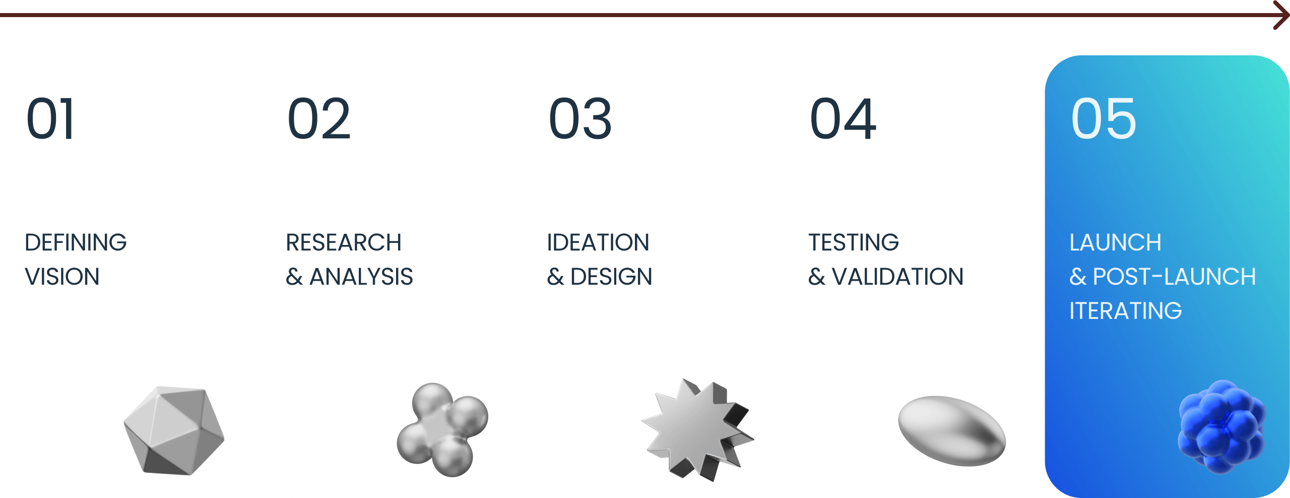
The journey of the first visitor starts on the landing page. To gain access to the personal account, merchants need to register, go through the verification process, sign an agreement and carry out technical integration.
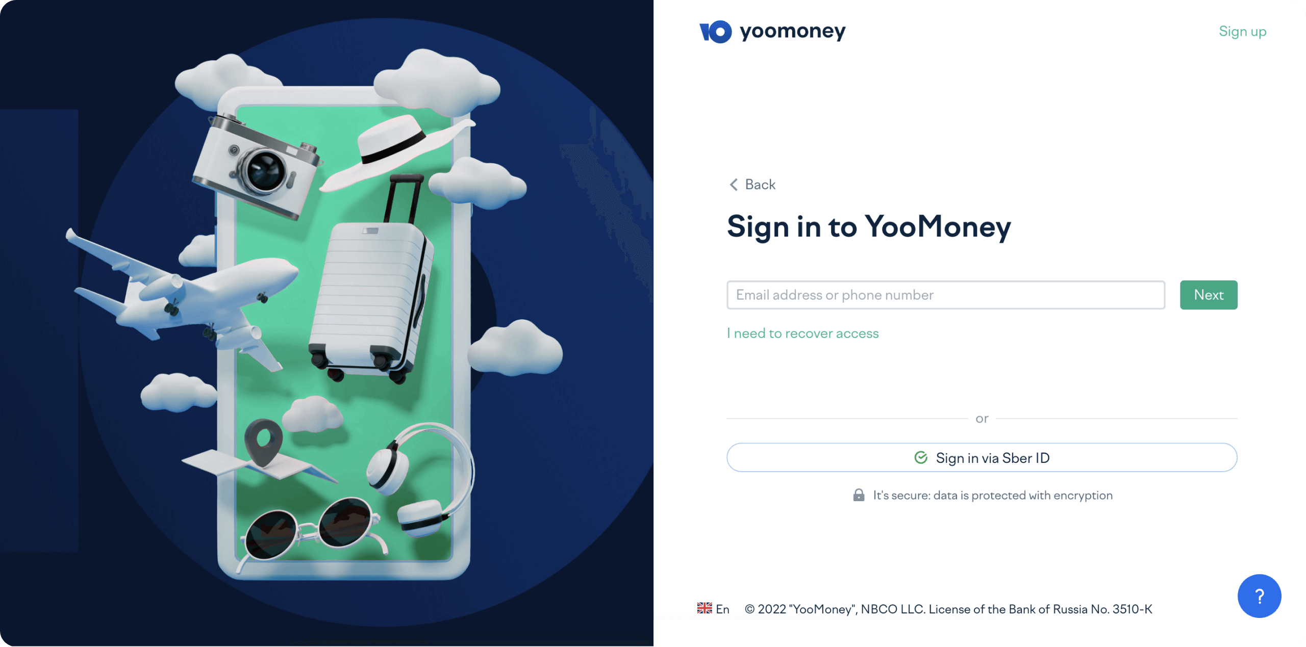
Yoomoney ex.Yandex.Checkout – A fintech service for accepting online and offline payments. Stripe-ish. With MAU 10k merchants.
Yandex.Checkout has been the most popular payment application in Russia since 2015
Context
Onboarding looked something like this. First, a client leaves an application on the Cashier's website with the company details. Then our manager checks them and sends a letter with the connection conditions, a questionnaire and a list of necessary documents: copies of the TIN, PSRN, organization charter, etc. (around 10 pieces total). After a lengthy correspondence (5-10 letters on average), the manager receives a complete package of documents and prepares a 21-pages contract with an appendix. Once it's signed, it goes through the approval process with our lawyers, security, financial monitoring, and other internal services.
I was the only designer working on the new onboarding experience from the beginning of the project to its release.
New onboarding process in Russian
Business problems
-
A large technical debt. There was a need to migrate from a legacy solution to React
-
Too many support requests. It became expensive for business
-
Low user satisfaction with the entire onboarding process
-
Declining conversion to user registration
-
A continuous slowdown of new active merchants growth
Early Explorations
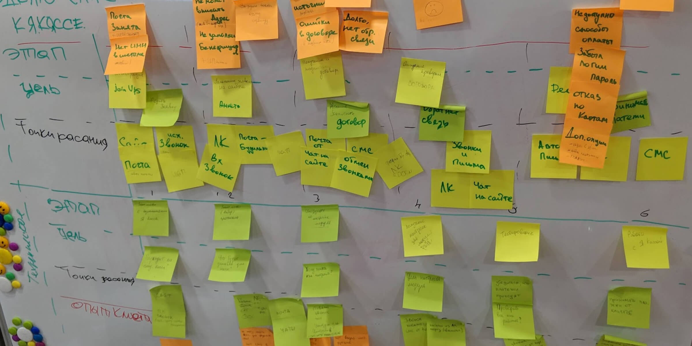
To understand the user problem in more detail, I asked the product manager to speak with the support team. I spoke with 10 support agents and invited the product manager to a meeting with the entire support team. We talked about the most recurring problems and created the user flow together.
Listening to the Feedback
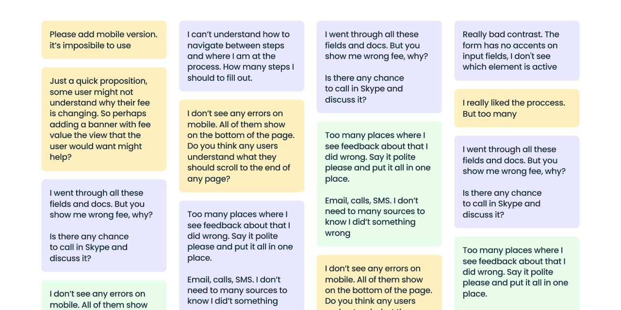
We confirmed the issues during further one-on-one user interviews and surveys. Customers wanted to solve five main problems:
-
They couldn't sign up and fill out a company questionnaire from their phone because the form was not adaptive
-
There were too many fields to fill out
-
The platform commission wasn't clear, so they were afraid to sign the contract
-
There were too many communication options when they wanted to request additional documents from the security service
-
Unclear onboarding progress
Finding our way
Having collected all the initial data and studied the onboarding process in similar products, we settled on testing the three most used patterns:
Option 1: Chat
Option 2: Main page with progress bar
Option 3: Ready-to-work platform after registration
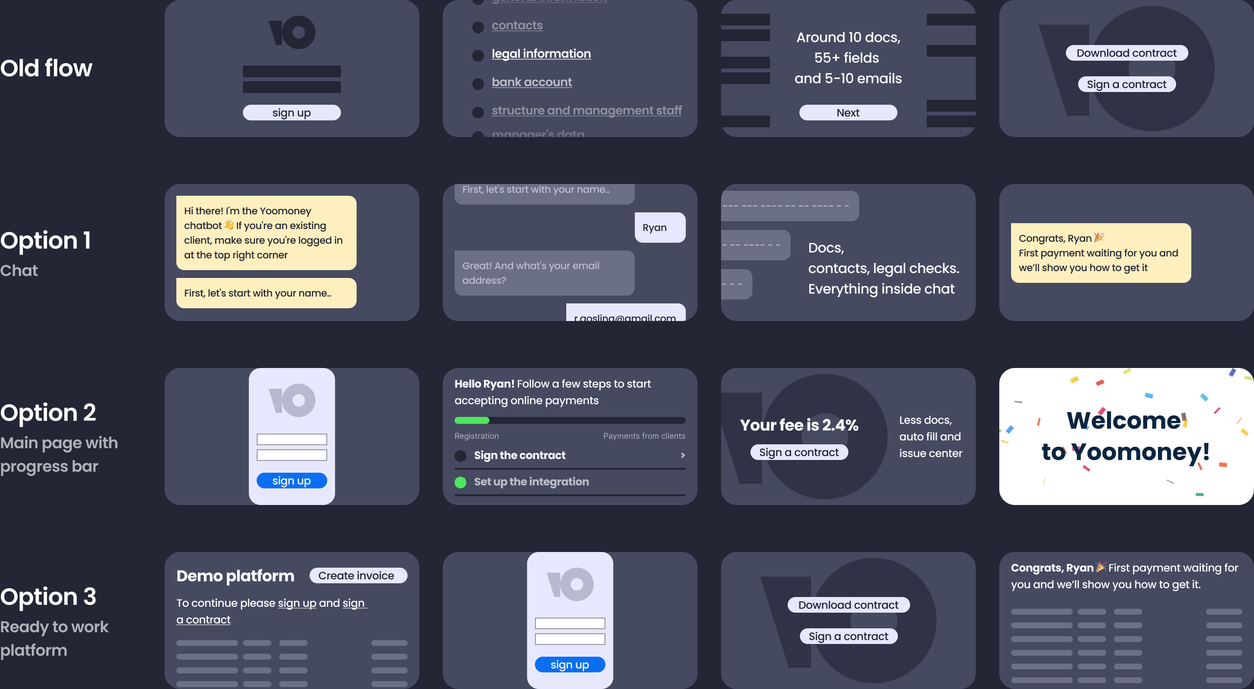
After running some tests with users and grooming with developers, we chose the second option. We wanted to optimize the current process, slowly update the mobile version, and only then create additional pages and features.
Scaling for features
Registration
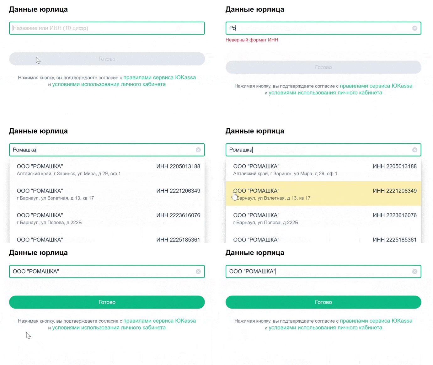
The very first step of registration must be simple. Therefore, we added the DaData API service to the registration form. A client now can type in the company's or the entrepreneur's name and find the right TIN.
Applying for conclusion of a contract
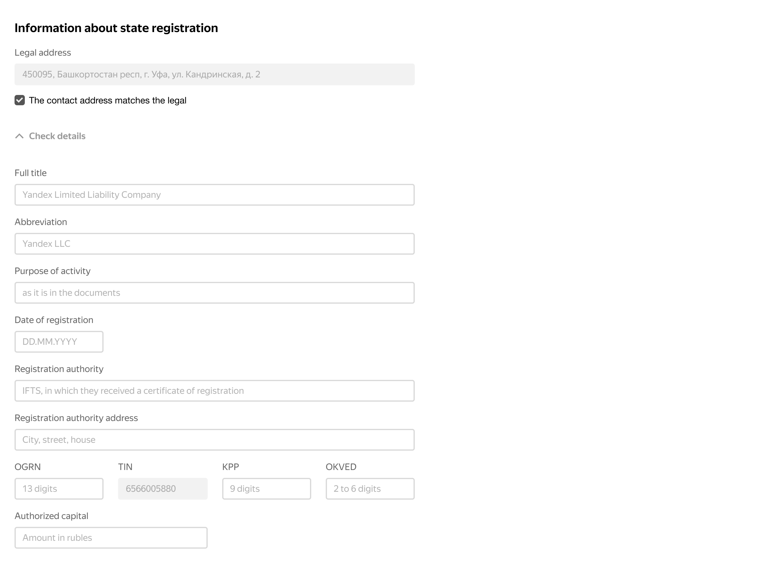
Instead of entering information manually, we decided to automate data collection using third-party services. We found out that our lawyers and commercial department were already using SPARK for gathering information about state registration, so it was easy.
We thought: “Why not automate this process as well?”
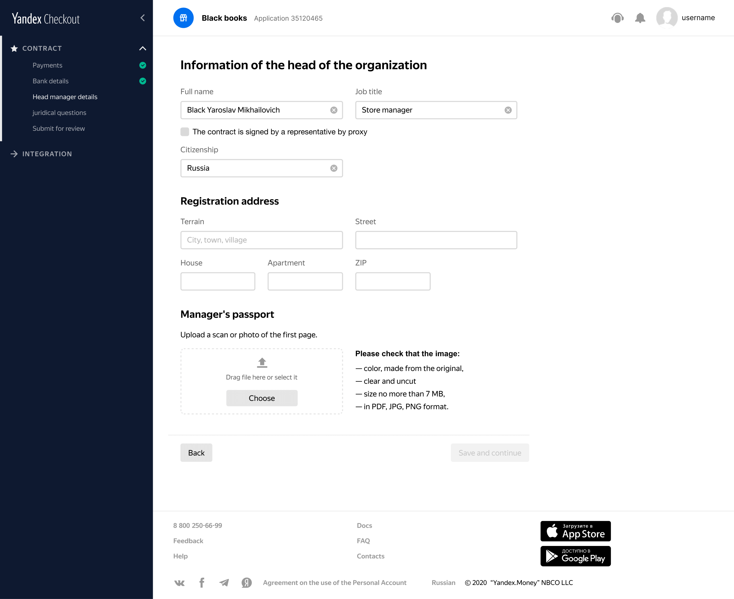
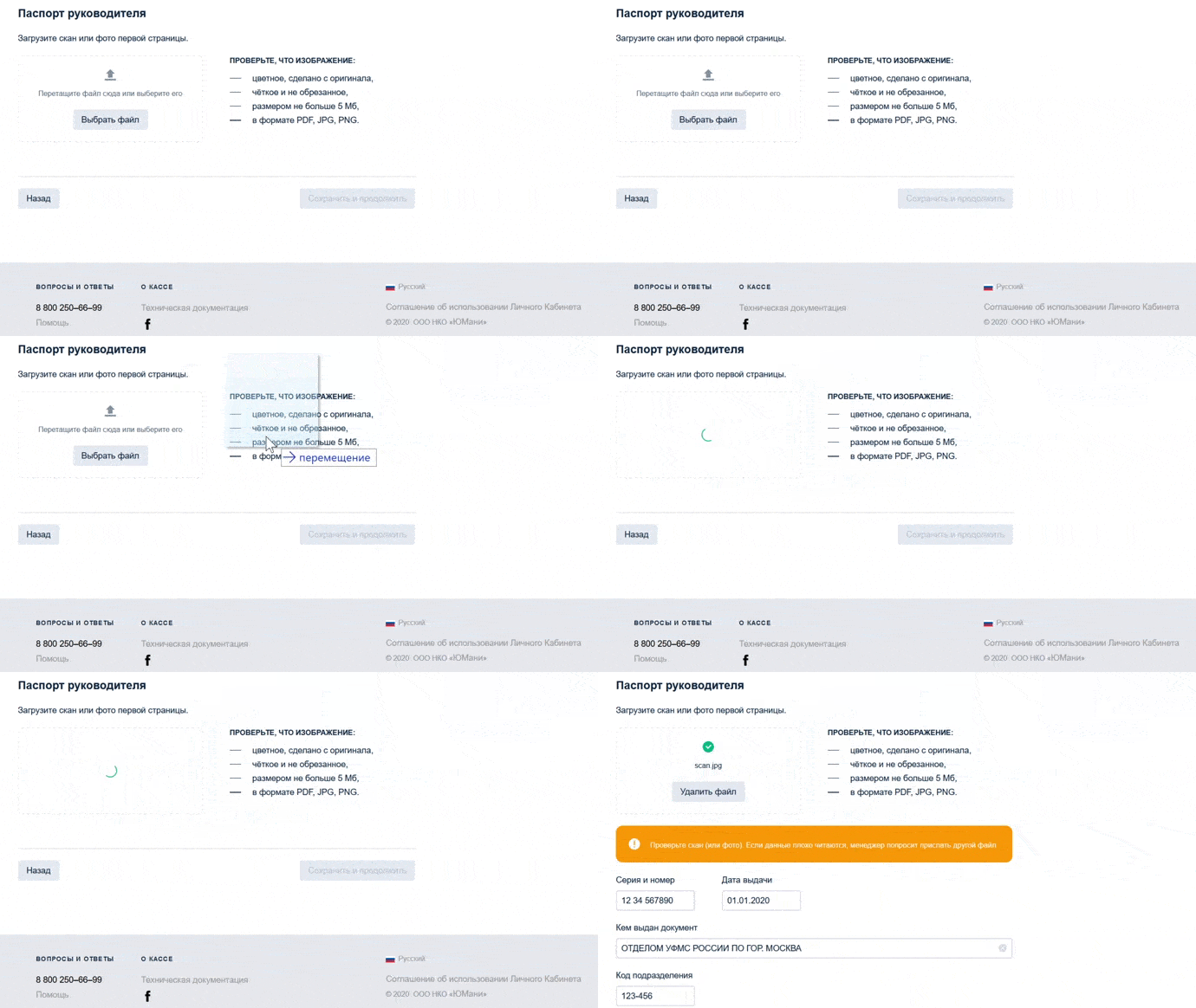
To finish the application, we also need the head of the company to provide they passport details. We thought that we might automate this process as well. We opted for the DBrain software for passport scanning. It analyzes the scan or photo and extracts personal data quickly.
Conclusion of an agreement
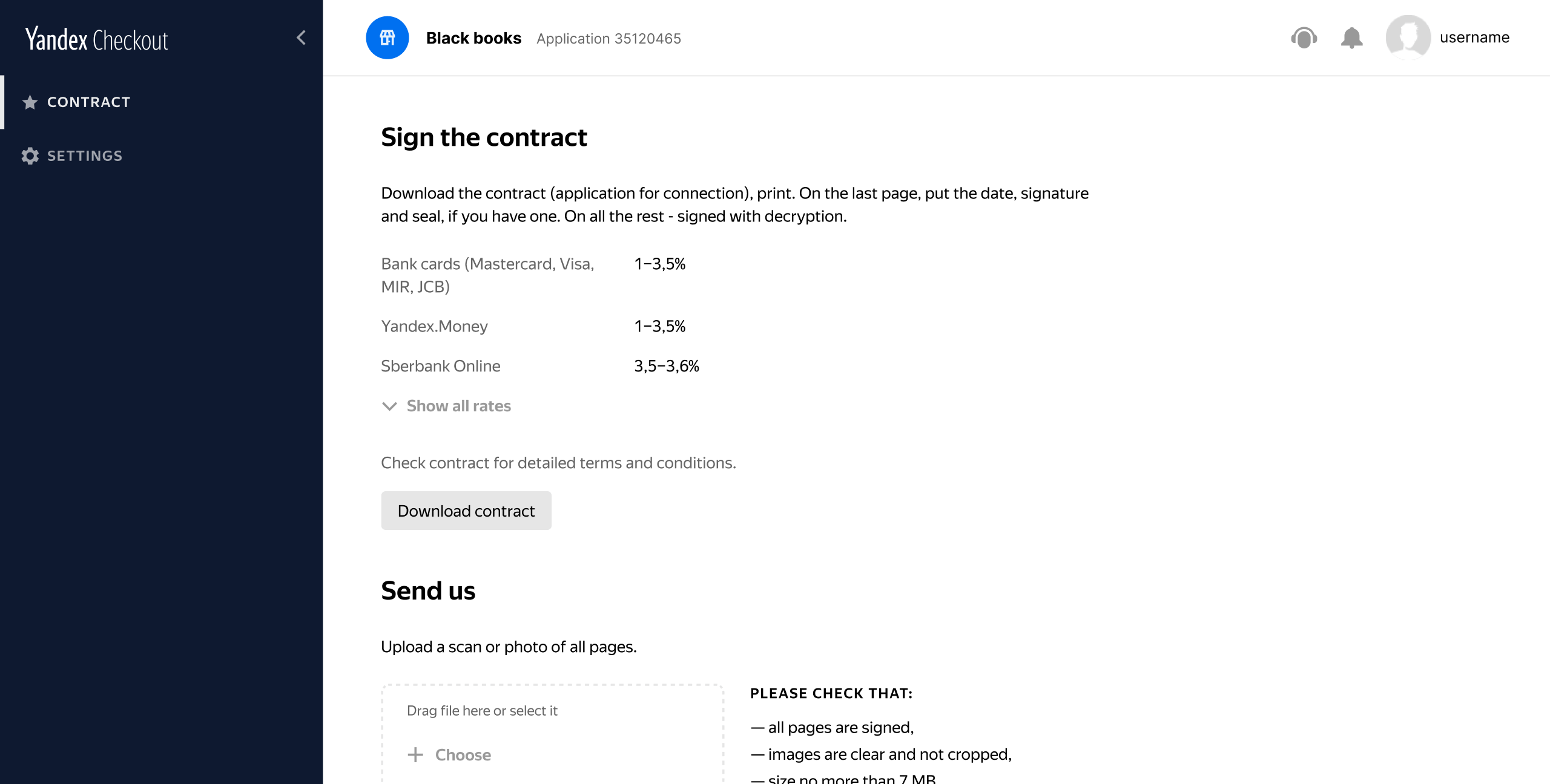
While the security service checks the application, a client can sign an agreement with us. They can upload a scan of the signed copy to their account or sign electronically with eSignature. For that we use one of the most popular digital workflow systems in Russia called Diadoc.
Support
If something is wrong, the manager needs to inform the company about it. We used to do it by email. Now, this process is also automated. In case of problems with the application, the client receives a link to his personal account with all the details via SMS.
After the conclusion of the contract and the security checks, a store is ready for work. Now, a client can create an API key for payments and billing.

Main page
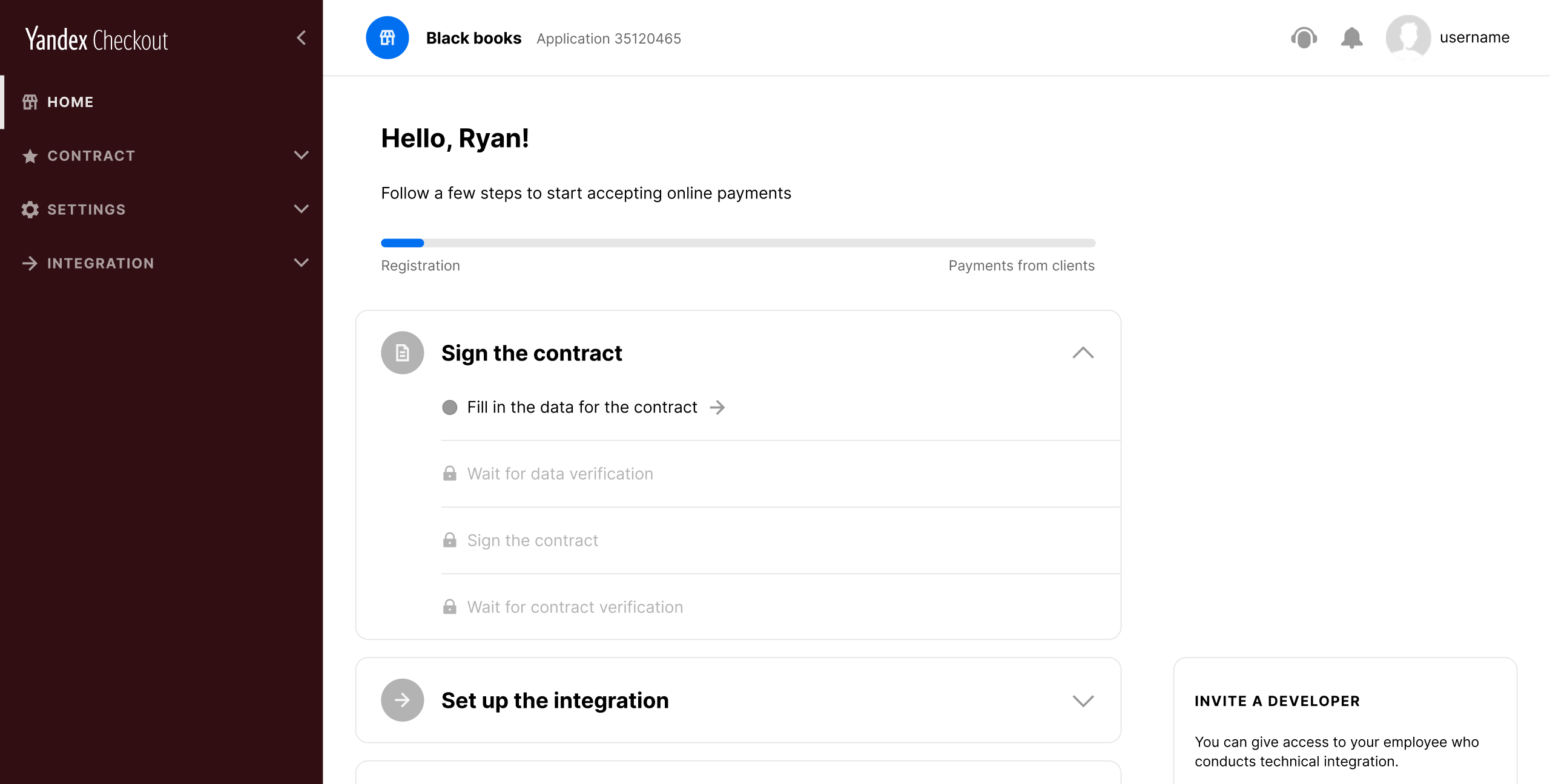
Last but not least, we added a page showing the current step of the onboarding process. Merchants now can actually see what needs to be done or fixed.
Little things for the team between iterations
I analyzed lots of similar services and talked to many of our clients. One of the things that I kept hearing from them was a suggestion to make an onboarding process a bit friendlier. I searched for open-source solutions and found the ones that I liked to refresh the design a little. Nothing too fancy, just some minimalistic illustrations and animations. However, our merchants loved it.
Sometimes when you work on a large and complex part of the product, you get caught up in the process. Such small tasks give you an opportunity to distract a little and enjoy immediate results.

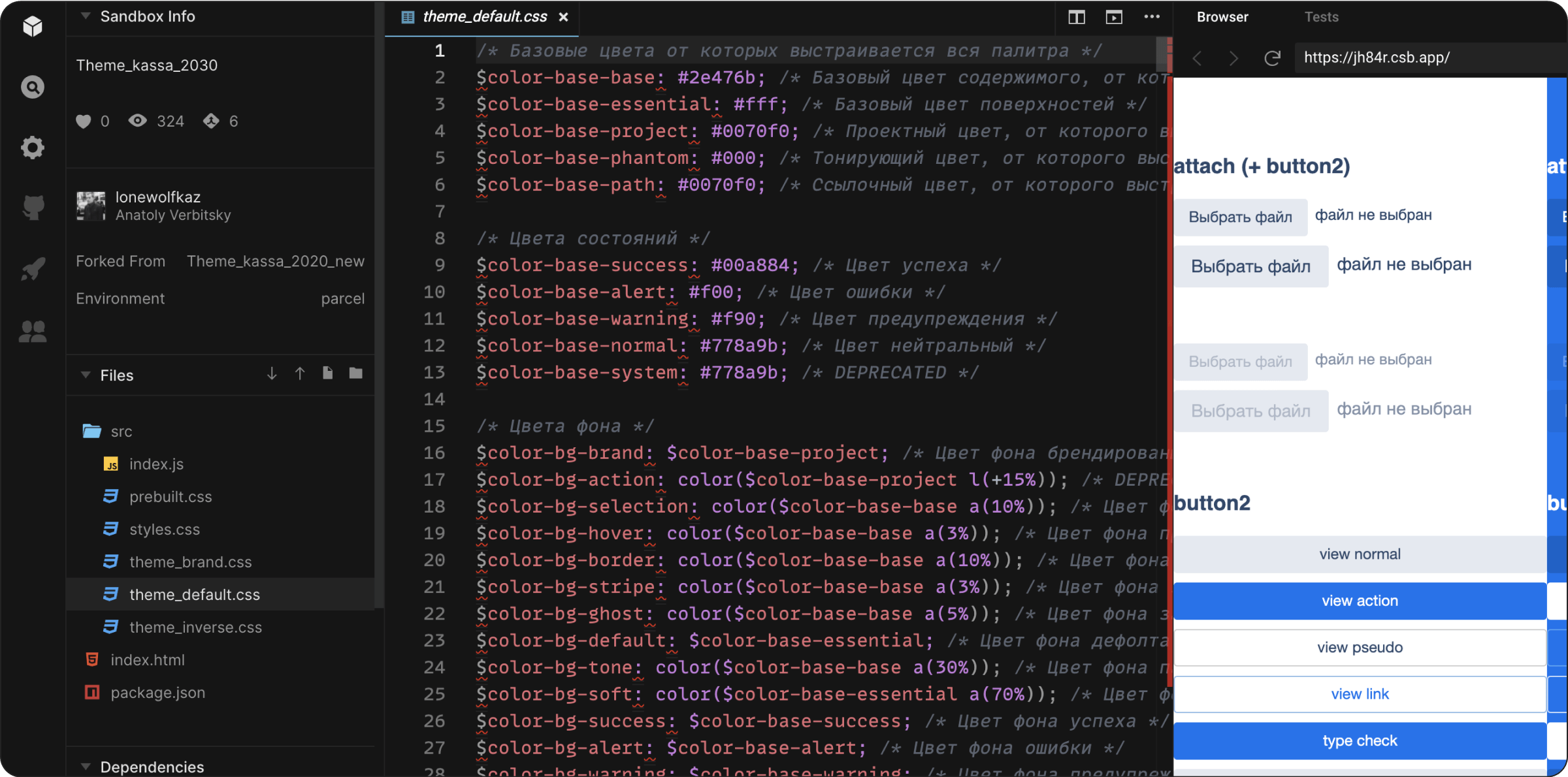
Product theme
During my work on the onboarding task, I also created a theme for the entire Yandex.Checkout. The system design team usually writes the code.
Check it on codesandbox ↗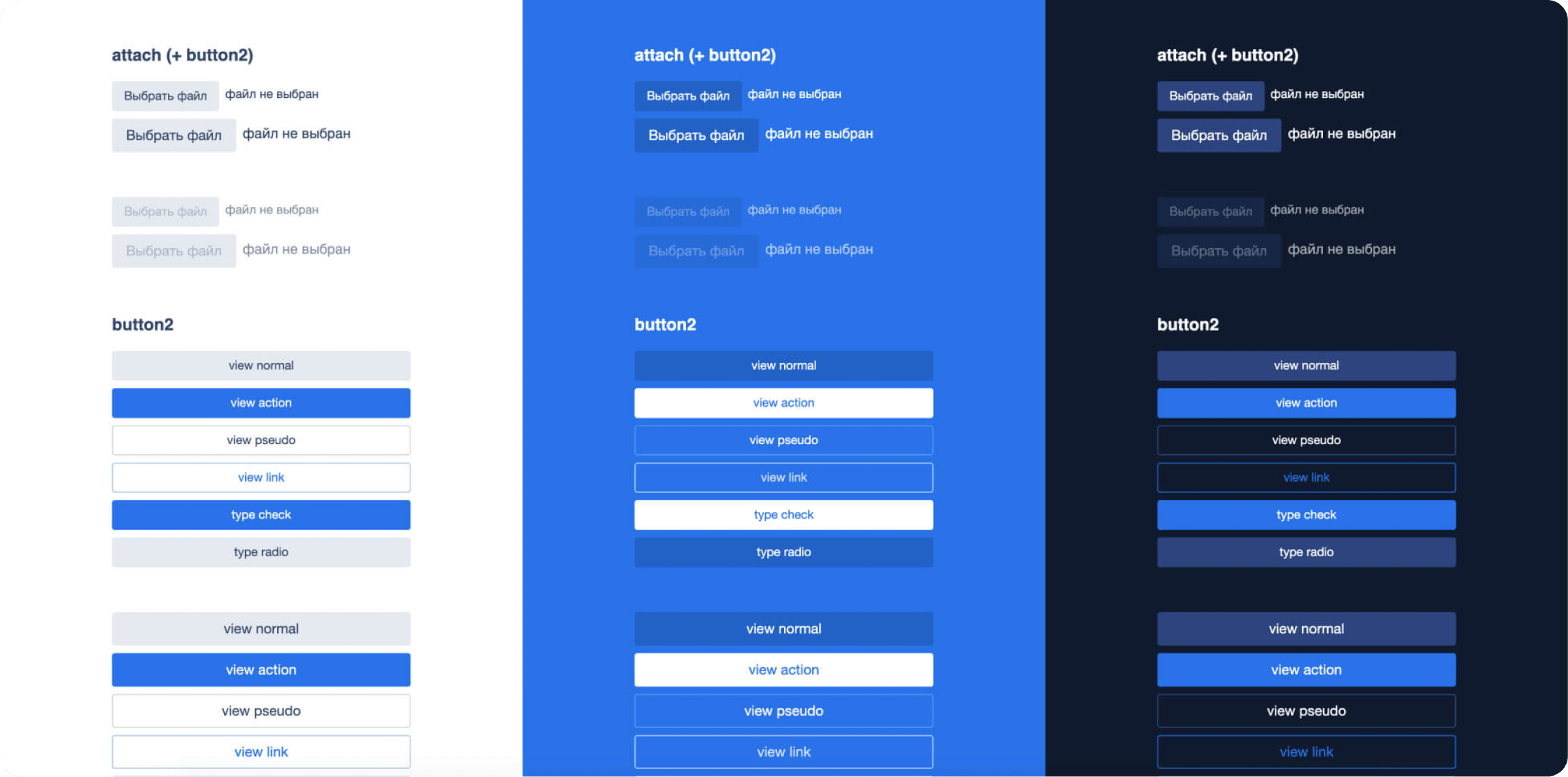
Testing and release
After successful prototype testing, we started building the design system components and simultaneously testing the improvements I described above.
For that, we divided our users into separate groups:
-
New merchants
-
Merchants that have been using our service for over 2 years
-
Merchants that use different acquiring services
-
Tech specialists
-
Managers progress
-
Other
Together with our product manager and the UX researcher we made about 25 calls.
It helped us prioritize improvements and create an iteration plan. We also ran a reverse A/B test with a large group of merchants. We opted for a soft launch and released the new onboarding process slowly in a gradual way. Each step gave us all the learnings we needed to move forward.

Impact
-
Onboarding time decreased by 1.5 times
-
Got a 70% growth of conversion rate
-
Merchants called navigation improvment the key change via feedback form & one-on-one calls
-
The number of additional requests for data and docs with errors is reduced by 43%
Learnings
This has been by far one of the most interesting projects I have worked on, especially because of the challenges that I faced and how I learned to overcome them with my process. This is what I learned throughout the design process:
Iterating.
Sometimes it makes sense to build the same thing on mobile and web and sometimes it doesn't. If we hadn't spent the time digging into merchants' needs and problems, the feature wouldn't have been adopted that well.
Understanding API integrations.
One of the key things I learned while working on the redesign of the Onboarding was the importance of understanding API integrations. As a designer, it was essential for me to have a clear understanding of the APIs we were implementing in the Onboarding process, in order to design around their capabilities and limitations.
Team Management.
Since this project had many stakeholders involved, everyone would pitch in their perspective, and feedback was always coming back and forth. It was essential for us to document this feedback in one place (Miro) and manage the stakeholders’ expectations with our next iteration.We would gather in one place and discuss each input before proceeding with our design to ensure we understand it thoroughly.
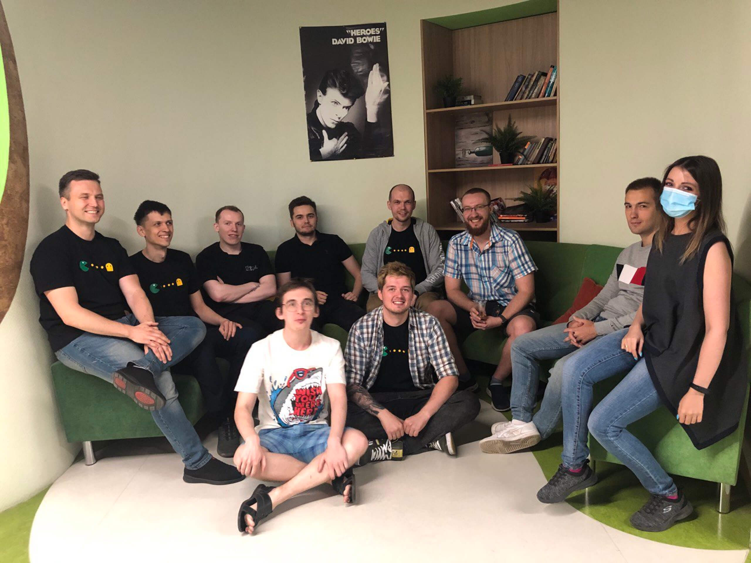
Our team
Product Manager
Albert Yanov
Project manager
Ivan Zverev
UX researcher
Artem Terekhov
Frontend developers
Ilya Lomtev, Artem Lopatin, Ilya Isupov
Backend developers
Igor Ryabtsev, Kirill Zubkov
QA Engineers
Anna Maslakova, Max Suslov
Have a question, some feedback, or an outrageous idea?
Please, please, please send it my way