2021 – 2023
I joined AliExpress as a senior product designer in 2021. Over the course of almost a year, I worked on web and mobile projects in Design system team and Business domain. Business domain includes more than ten teams.
In 2021 AliExpress was already a huge product with more than 10m daily active buyers and 100k sellers worldwide. Dozens of modal windows, controls, and styles, were stored inconsistently across the whole product (in code and in Figma files). As the Product team grew, it became crucial to systemize all components to scale the product consistently.
We decided to build a Design System to help designers, PMs and developers communicate with each other in order to build consistent high-quality solutions faster.
Yoomoney ex.Yandex.Checkout – A fintech service for accepting online and offline payments. Stripe-ish. With MAU 10k merchants.
Yandex.Checkout has been the most popular payment application in Russia since 2015
Review
I reviewed every pixel of AliExpress Business to come up with a structure of our new Design System. From the color system and typography to buttons, inputs, and dropdowns — I built the system step by step. Since I was passionate about product consistency, I led this initiative and managed the implementation of the Design System into production. With a group of enthusiastic developers, we redesigned old components and refreshed the look & feel of the product.
01. Color theme
Core colors
We used these colors to generate other variables using CSS HLS functions
Check example ↗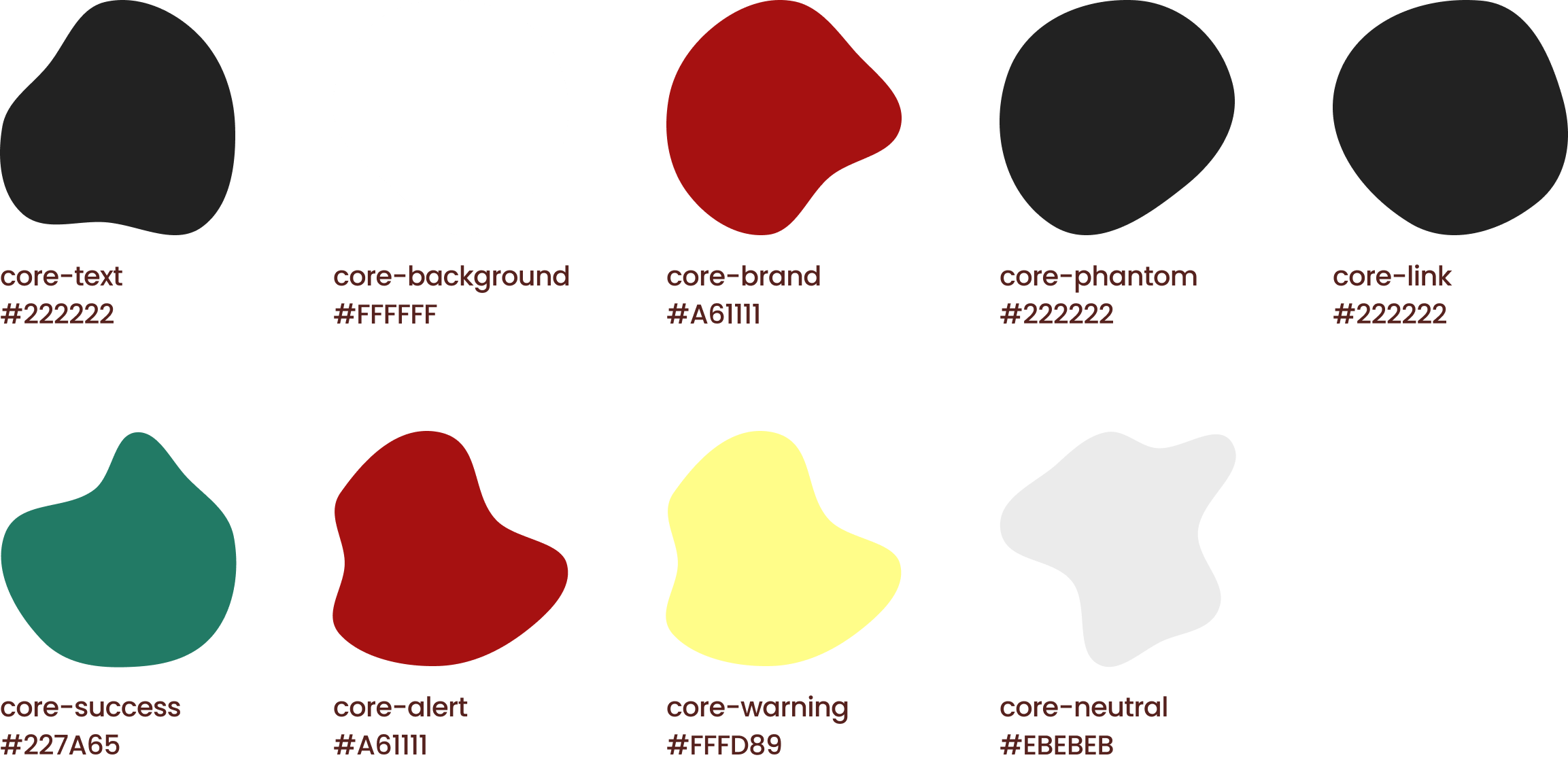
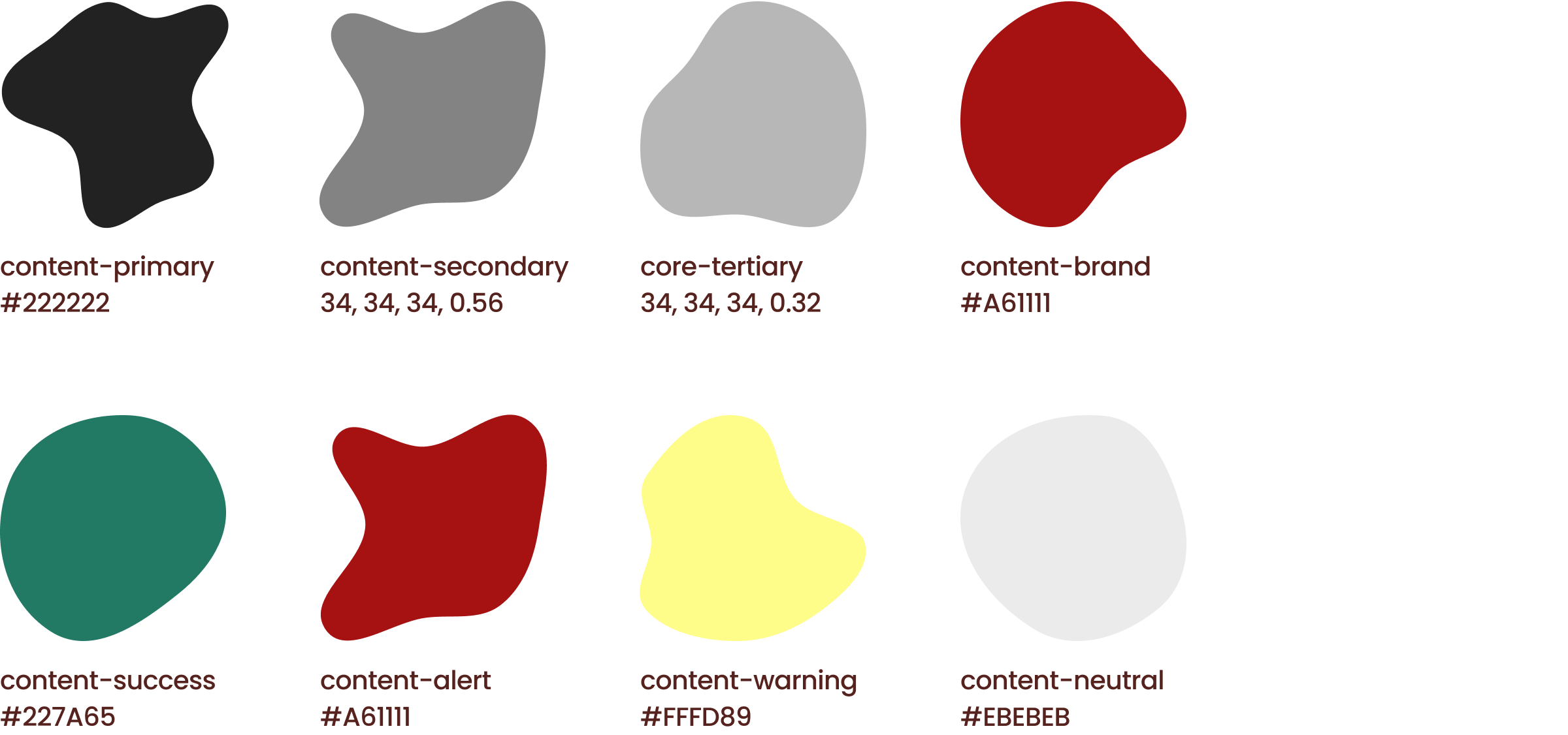
Content colors
This palette we used for text, icons and illustrations
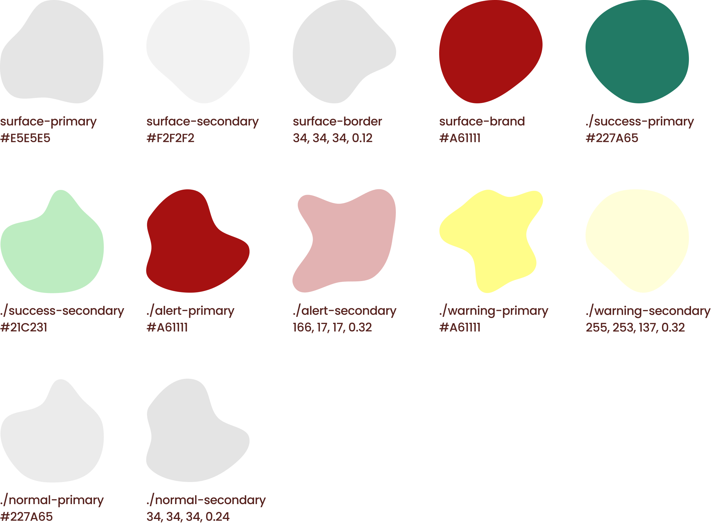
Surface colors
This palette we used for static and interactive surfaces
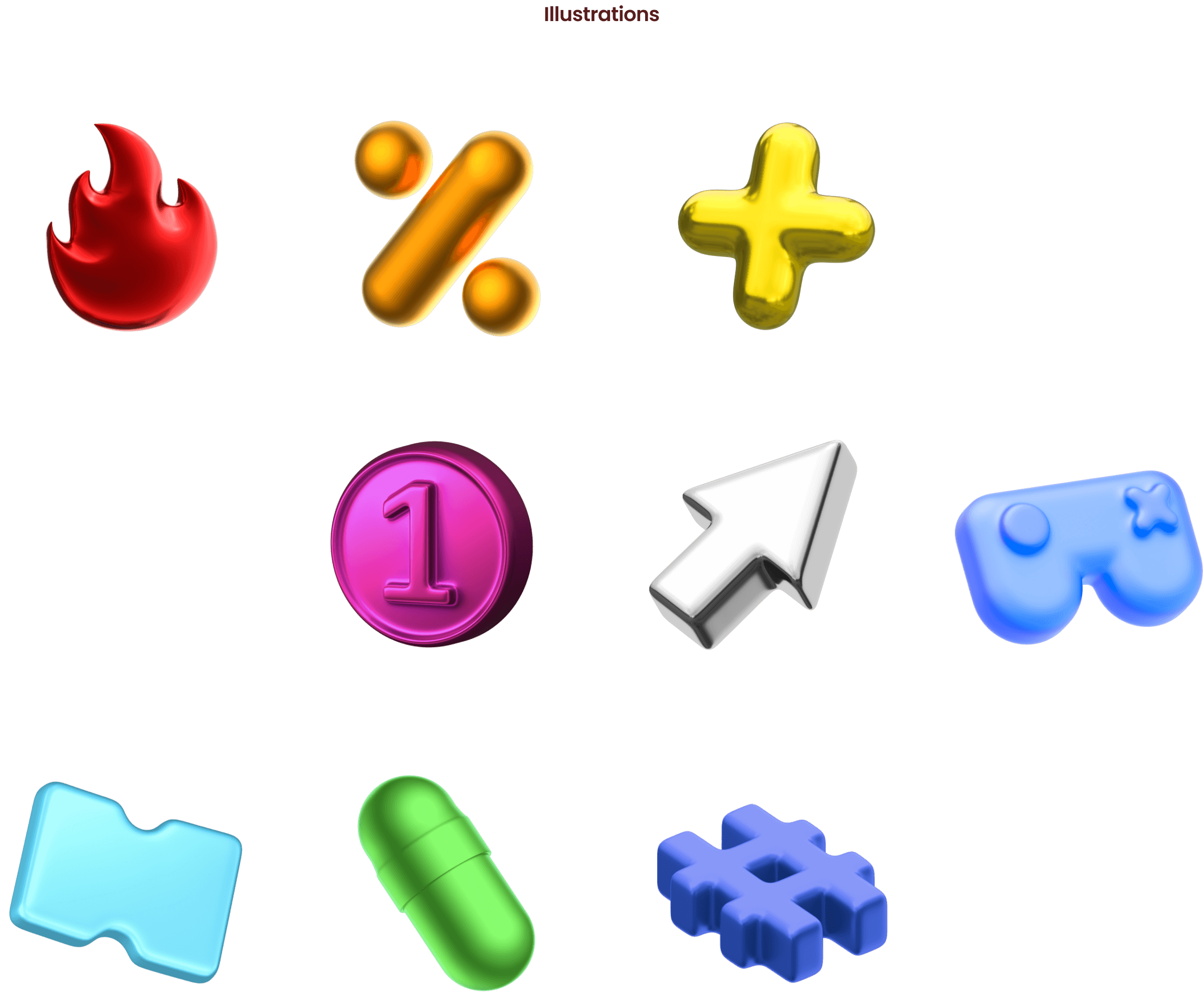
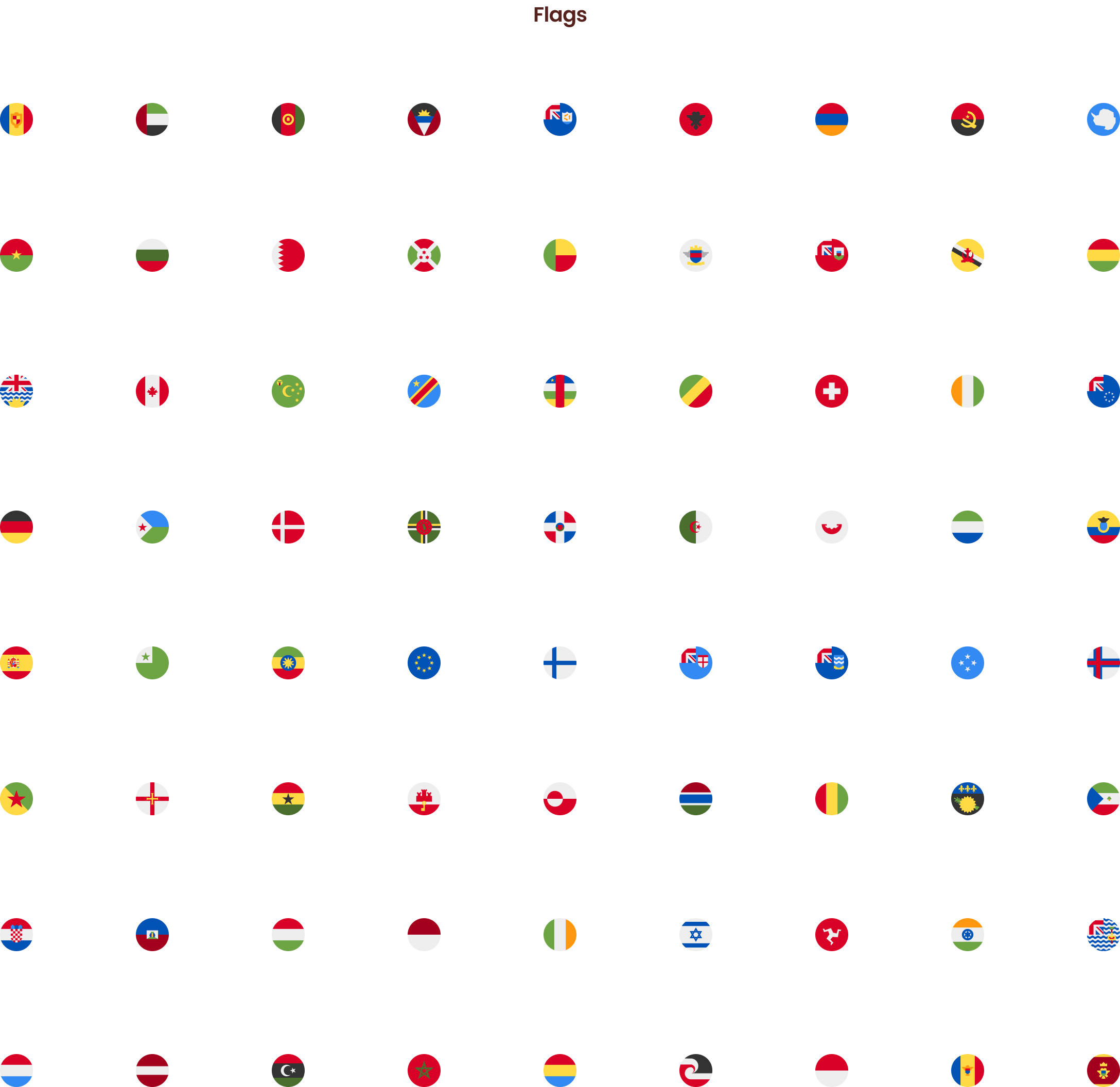
02. Content
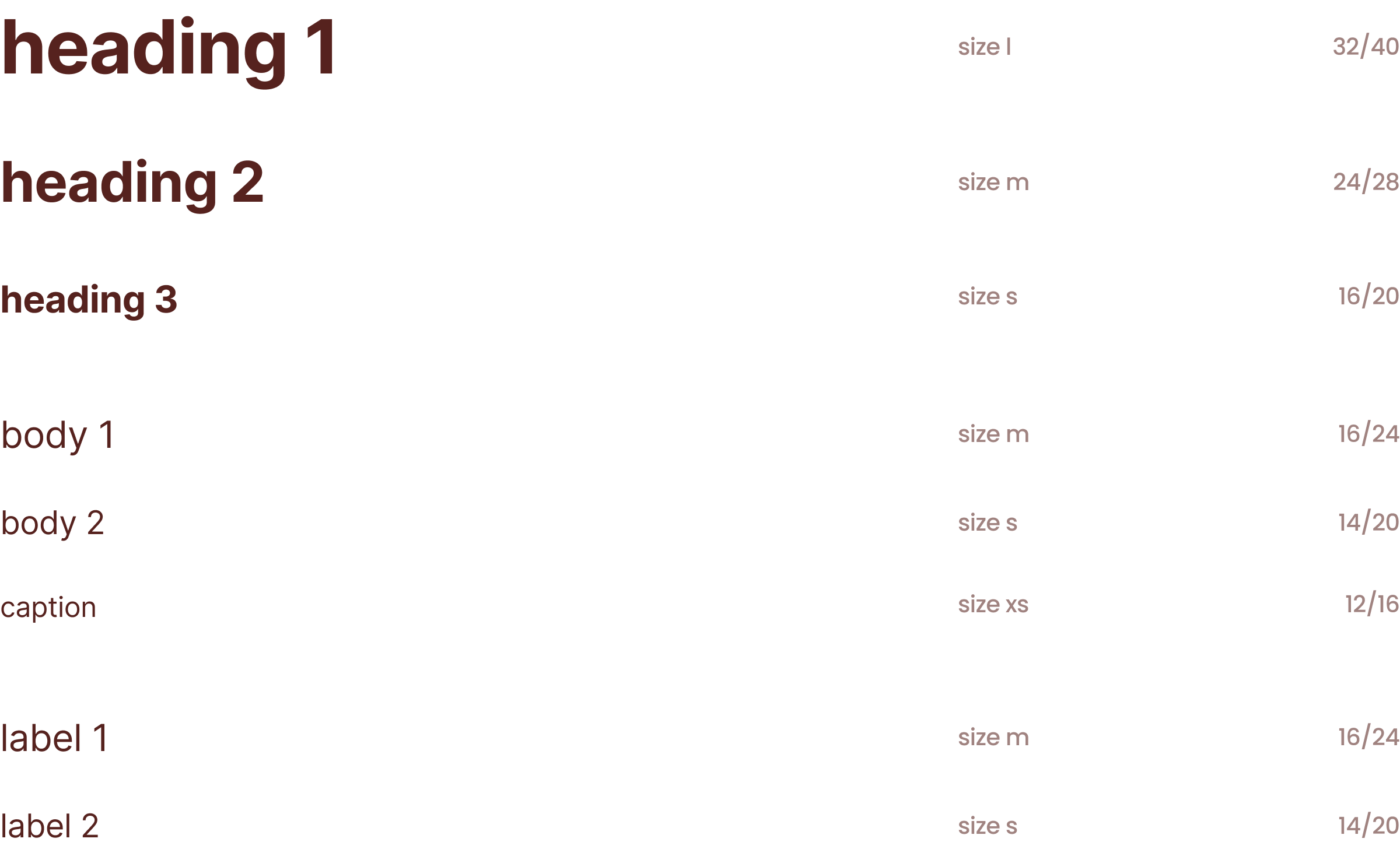
03. Typography
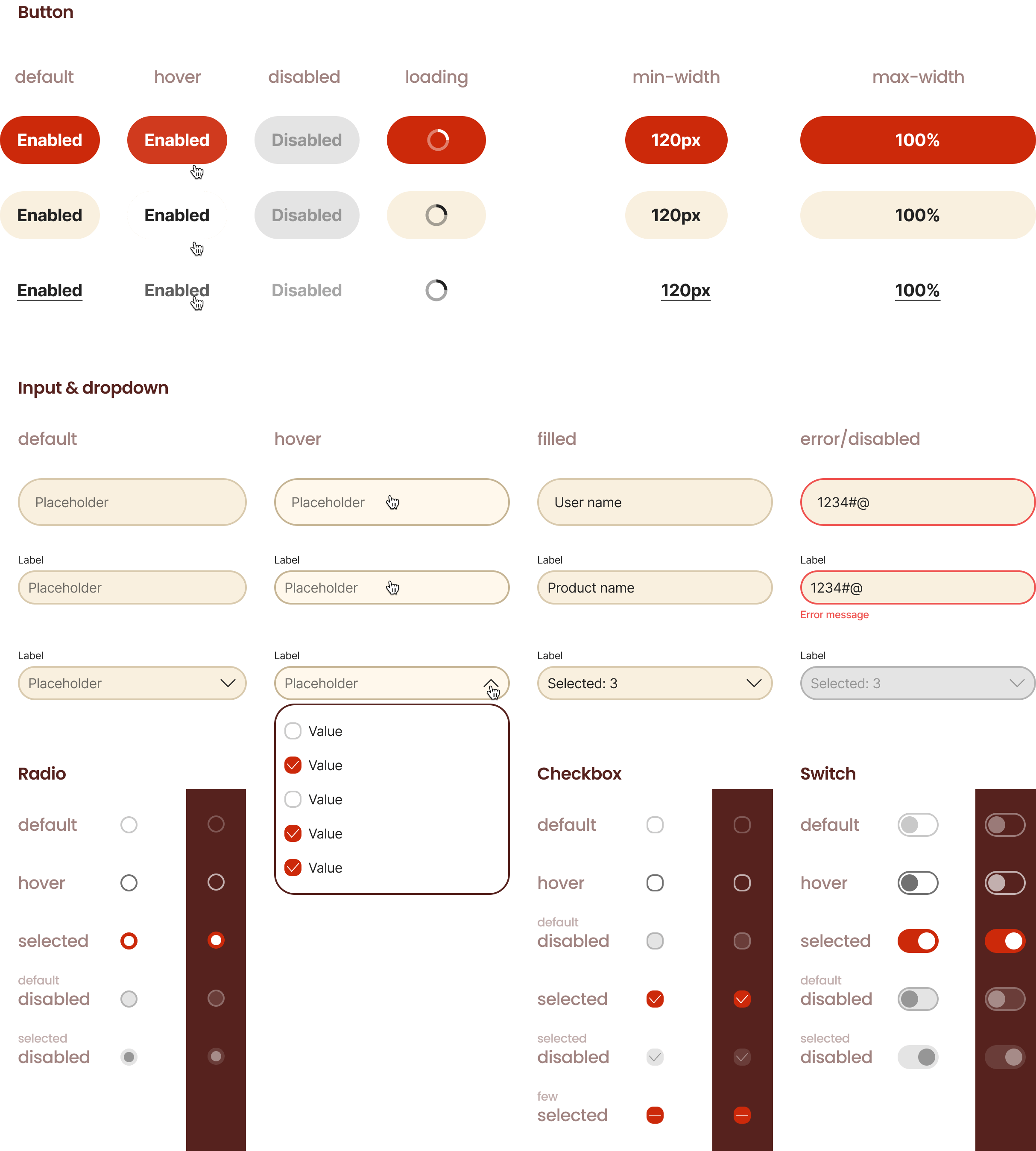
04. Controls
05. Patterns
Have a question, some feedback, or an outrageous idea?
Please, please, please send it my way