How we simplified the file structure in Figma

2019 – 2022

This article is about moving from Sketch to Figma and finding a clear way to organize design files

Check it on Medium ↗ File template ↗

A Few Words about Me

I am Anatoly Verbitsky, Principal Designer at Alibaba Group, AliExpress. Before I worked at YooMoney (former Yandex.Money).

Along with my key product tasks, I was interested in dealing with the processes in UX team and making our work visible and clear to everyone in the company.
file-cover

So, my challenge

Previously my work on a new task started with a blank file in Figma. This approach can work well only with low workload. But when you have 50, 100 or even 1,000 layouts in one file, it’s really challenging to navigate through them.

I collected the main problems the team faced when they come to the file from Jira task:

  • What task is about and what problem it solves?

  • How competitors solve similar problems and why we chose this particular solution?

  • What is the status of the file and how to track its changes?

  • Whether the design and the text of the layout are approved?

  • Where to find file’s change history?

  • Is the layout still up to date?

Let me clarify. In 2019 there was no Figma Community yet, and each team, including mine, was looking for its own way to work out the problem.

What goals I set

Transparency was always the main principle of our work. As a team we encourage everyone to investigate problems and find the best solutions together. UX is created not only by a designer and editor, but by all the team members — from a product manager to a developer. I started to look for simplified ways to organize layouts in Figma to make the work on tasks more transparent and clear to everyone. Each file needed to meet the next criteria:

  • What task is about

  • Where to get related links (PRD, task in Jira, Miro board, UX research, etc.)

  • What the problems users and business face

  • How we can solve them

  • How we will test our solution.

The solution I found

Everyone used to work in their own way, and I did not want to break the workflow. I came up with a template with no rigid framework, but with a single file structure and universal rules to maintain the layout. Let me elaborate.

file-cover

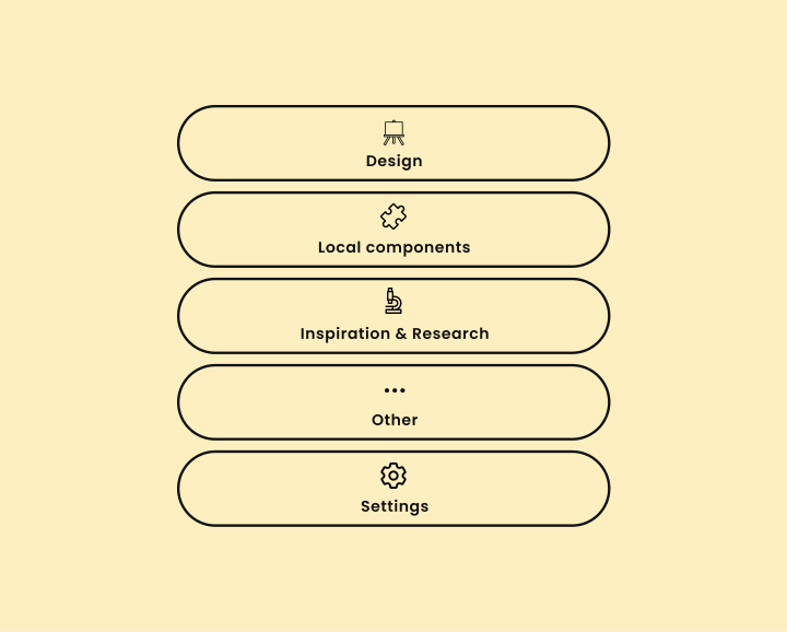
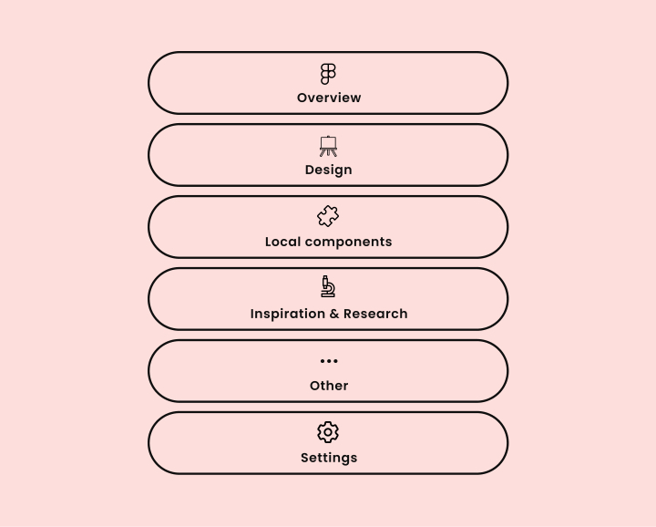
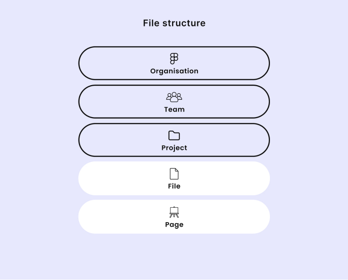
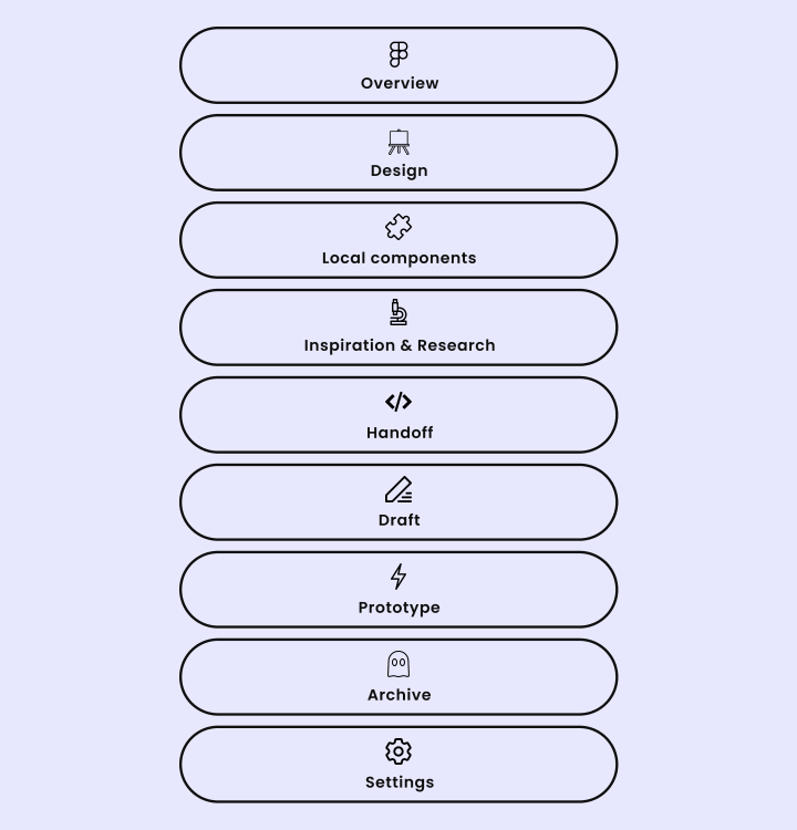
Figma file structure

Basics

  • Overview.

    File description, problems and solutions

  • Design.

    The updated version of one task’s layouts

  • Local components.

    Page for storing the necessary components to simplify the management of the current file

  • Inspiration & Research.

    Moodboards and detailed competitive research

  • Handoff.

    Description for developers: key screens, blocks, interactions, links to components in Storybook or repositories with real components

  • Draft.

    Sketches and ideas

  • Prototype.

    Page for prototypes.The page name corresponds to the scenario in the prototype

  • Archive.

    Irrelevant ideas — they can be used later

  • Settings.

    Components for the design of pages and the file cover.

file-cover

How to work on small files

  • The design process starts immediately on the Design page. The description of task, problem, solution and links are all stored here.

  • Overview and everything that is not necessary can be deleted (Draft, Prototype, etc.).

file-cover

How to work on complex files

  • Overview.

    To store links to related tasks (task tracker, other files and pages in Figma).

  • Design.

    The single source of truth. It is always kept updated. If the file was not updated for a long time, the cover should be marked with the thumbnail “Outdated”.

  • Pages with numbers from task tracker are created below (e.g. DESiGN-1504). Each page has its own block with the description of task, problem, solution and links to the task and PRD

How else you can usethis file

While implementing this template within both companies I noticed that everyone started to use it successfully and found their own way to make the use of it even more comfortable.

Keep only file structure.

Some colleagues used a template for a single structure of pages, statuses, and design components. Other elements they chose independently.

Add your own components and pages.

Some colleagues felt that the set of components were not enough and they added their own ones. They separated research and moodboards into different pages, added new pages for keeping documentation of solutions and meeting minutes with developers and business.

Change nothing.

Because it really works.

About other parts of the file

file-cover

Examples of page layout

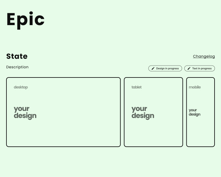
I created a blank template and added 3 examples of how to create a page from ready-made components. I divided them according to the difficulty of the task.

file-cover

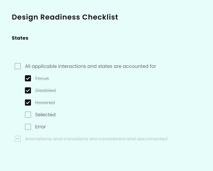
Design readiness checklist

I transferred the checklist from Dropbox to the same page.

file-cover

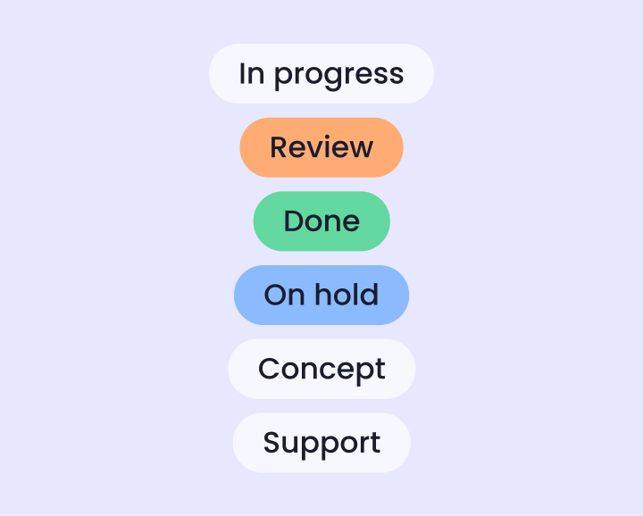
Layout status components

To make sure that everyone in the team understands the status of the design and text, each layout has a status component on the page. When you need to change all statuses at once, just select the component and Edit/Select All with the same Instance / Change statuses.

Changelog of a separate layout

If it’s needed you can add a detailed history of changes to the layout. Igor Lanko wrote a detailed article about it.

Examples of problem and its solution formulation

Overview page can be very useful not only for fast diving into the task, but also for protecting your project in front of business and demonstration of solutions at design critiques and other meetings.

Using the file in your company

To maintain the universal view of page design components I moved all the components to a separate file. I also added file cover, cursors, etc. — then made a library out of them. Therefore, the internal version of this file can be used as a template that will always be with up-to-date styles. If you plan to implement this template within your company and use Figma Organization, I advise you to do the same.

To conclude

Soon after the release of Figma Community, Dropbox added its own project template — It helped me to learn a lot about the approach to structure. Spotify also shared its approach to the design processes — I highly recommend to look through it.

Tell us about your approach to the organization of file and workflow. Use this design file template and share via social media with the tag @lonewolfkaz. I hope it will be useful and inspire you to create something brand new and beneficial to the community.

Have a question, some feedback, or an outrageous idea?

Please, please, please send it my way